Animation & Motion Design
Mairéad Ryan
They Shouldn’t Have Taken My Middle Finger
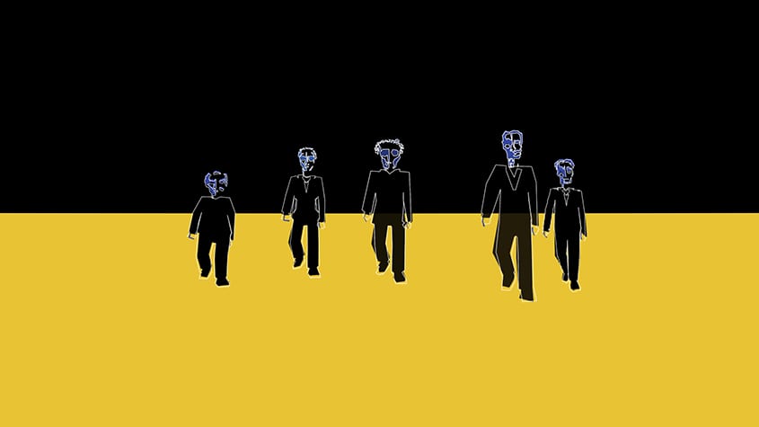
“At 5 o clock the five made their claim
They said she’d never disrespect them again
With one shot of a gun
Her finger was gone
They said she’d only herself to blame”
‘They Shouldn’t Have Taken My Middle Finger’ is a narrative about revenge and redemption. The story visualises the character and her displays of rage, regret and guilt as she struggles to come to terms with her misdeeds and has to learn to forgive herself.
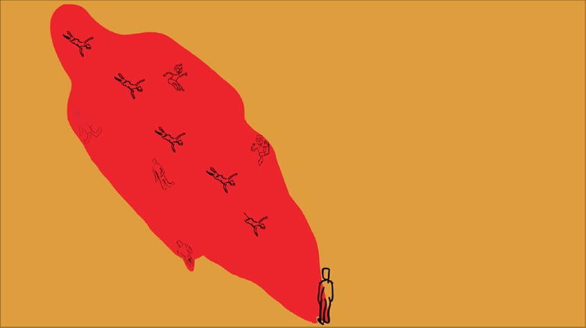
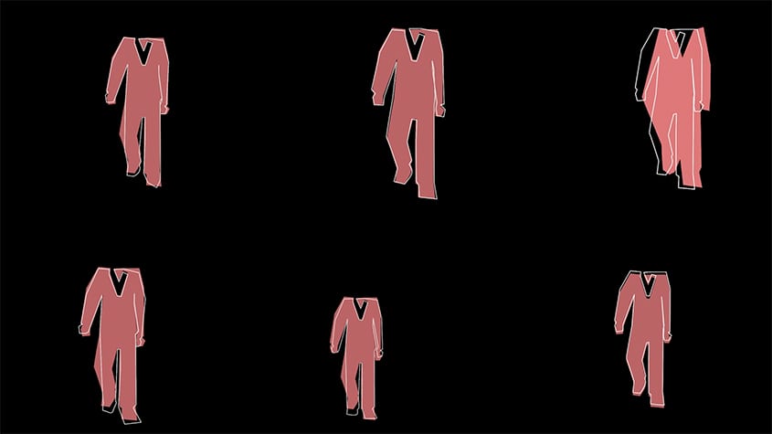
The visual style of the piece is contemporary and simple. Stripped-back colours and shapes emphasise the angular, graphic stylistic choices. These angular shapes are representative of the strong emotions portrayed. Yellow is symbolic of chaos and madness. The dry desert setting embodies the agoraphobic, lost, bewildered state of mind of the protagonist. This film was created with a variety of different techniques. Dynamic camera movements and choppy editing are used to emulate the protagonist’s state of mind. This mindset of spontaneous reactions and lack of logical thought process is prevalent throughout.
The film shows through the protagonist’s adrenaline addiction the harm it causes. Regardless of whether or not vengeance is exacted, everyone must eventually face the consequences of their actions.


